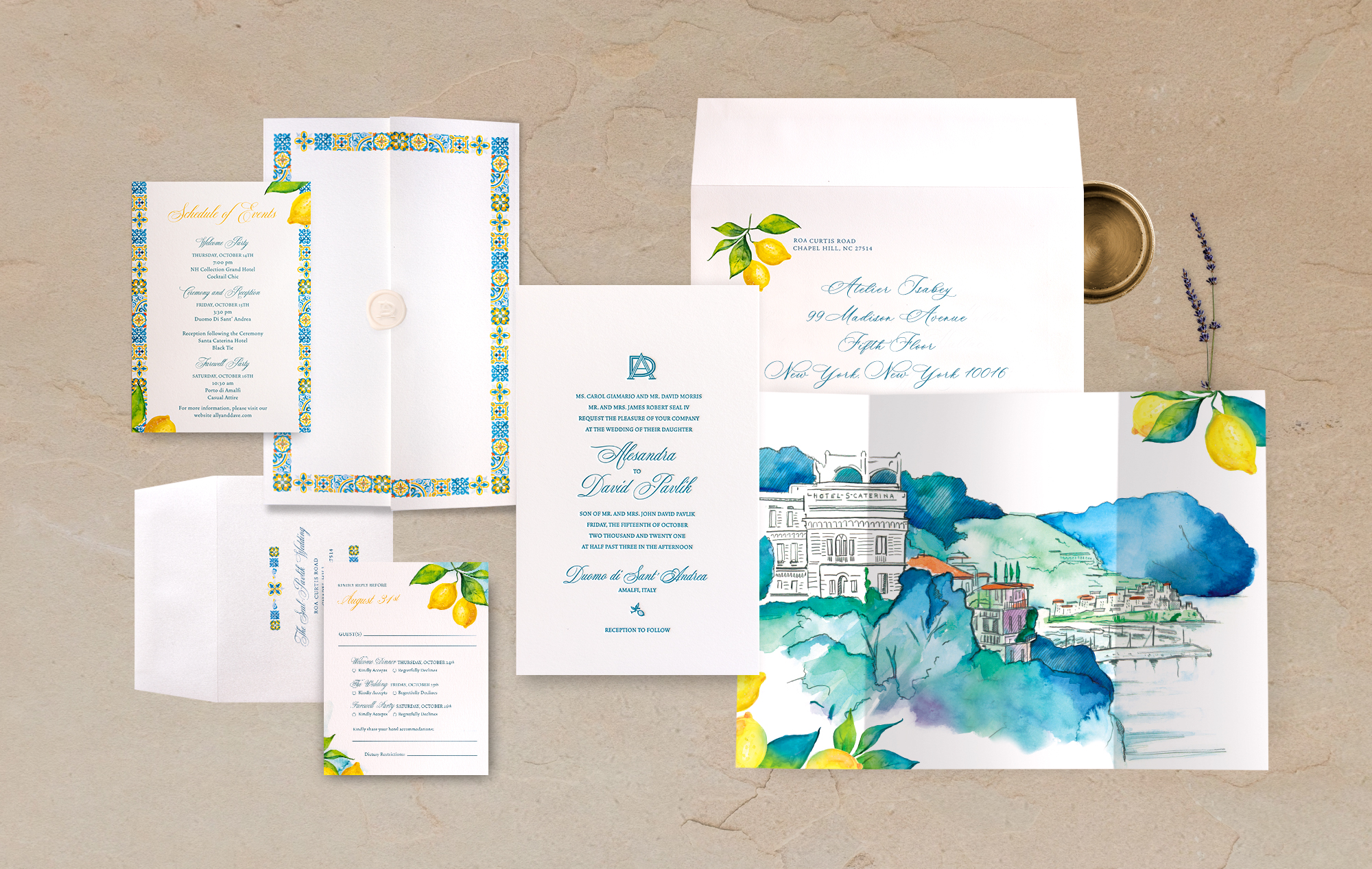
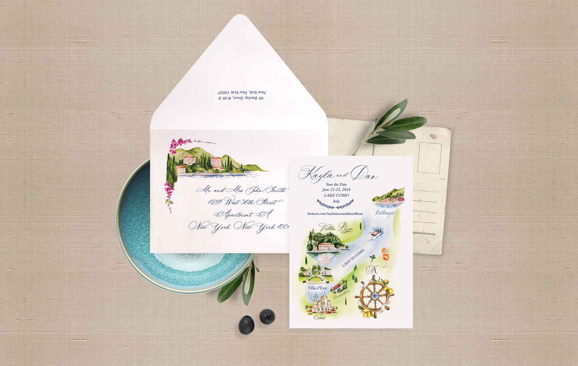
Italy Wedding Invitations
Italy has a way of capturing the imagination. From the golden glow spilling over Lake Como to the warm terracotta hills of Tuscany, from the pastel cliffs of Positano to the quiet charm of a Sicilian piazza, the landscapes, architecture, and culture themselves tell a story. And when you’re planning a destination wedding in Italy, your invitations aren’t just pieces of paper — they are the first experience your guests have of the celebration.
Here at Atelier Isabey, after 15 years of designing destination weddings and Italian invitations for couples who care about every detail, we’ve learned a thing or two about creating suites that truly reflect both the location and the couple’s story. In this article, we want to spill the fagioli — the beans — on how to make your Italian wedding invitations entirely your own, sharing insider tips, techniques, and insights that can help you capture the magic of Italy on paper.
TIP 1: LET IT MARINATE
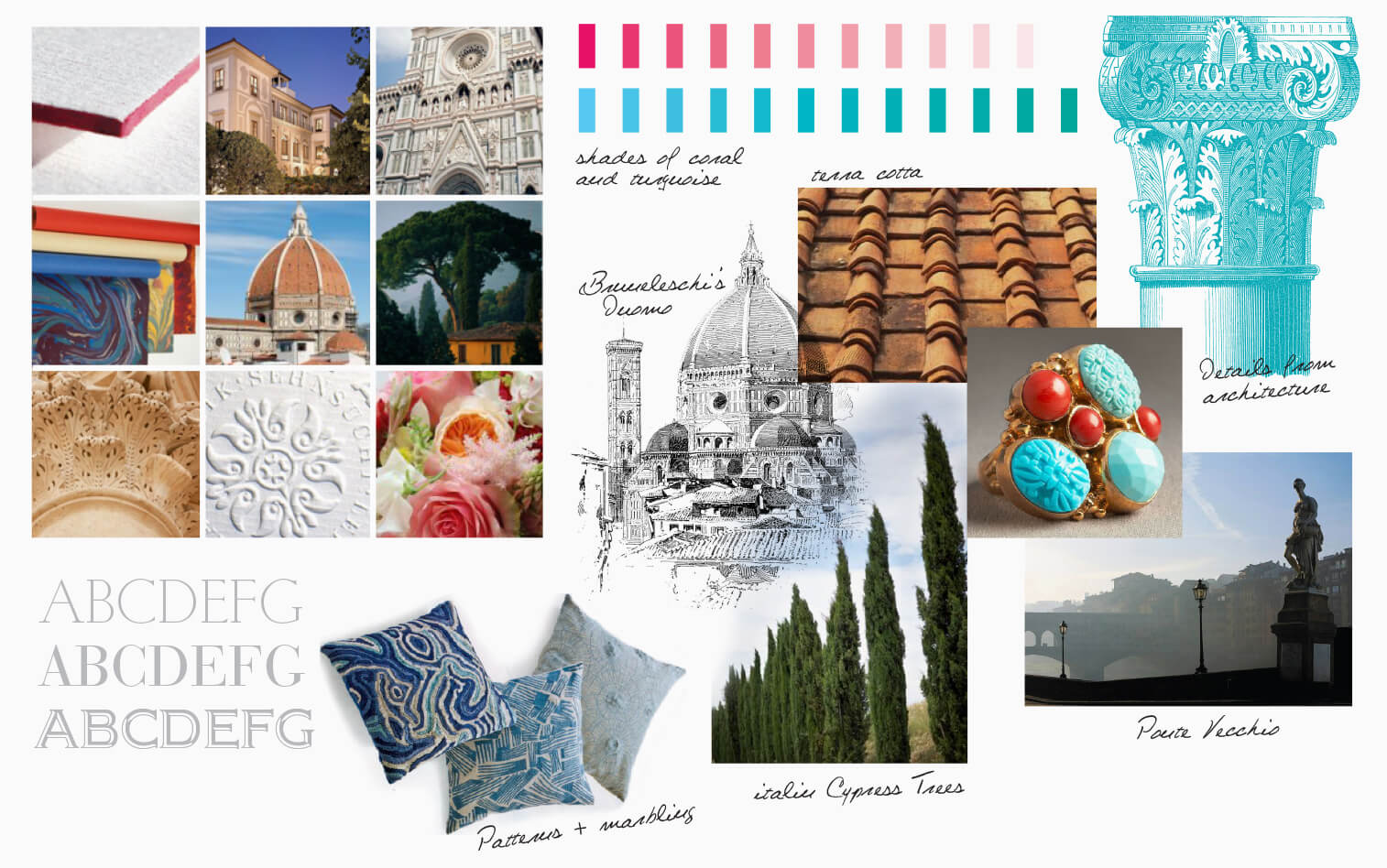
We like to call it “marinating.” And yes, it might sound obvious — of course you’d want to know what your wedding location looks like — but this is different. This is about soaking in the essence of the place, letting it slowly infuse your vision like a rich Tuscan ragù simmering on the stove or a fine balsamic reduction thickening over time. It’s a full sensory exploration: the play of sunlight on villa terraces, the texture of frescoed walls, the scents of citrus groves, even the rhythm of a cobbled piazza. Museums, local art, architecture, and cuisine all inform the palette, textures, and mood of your suite.
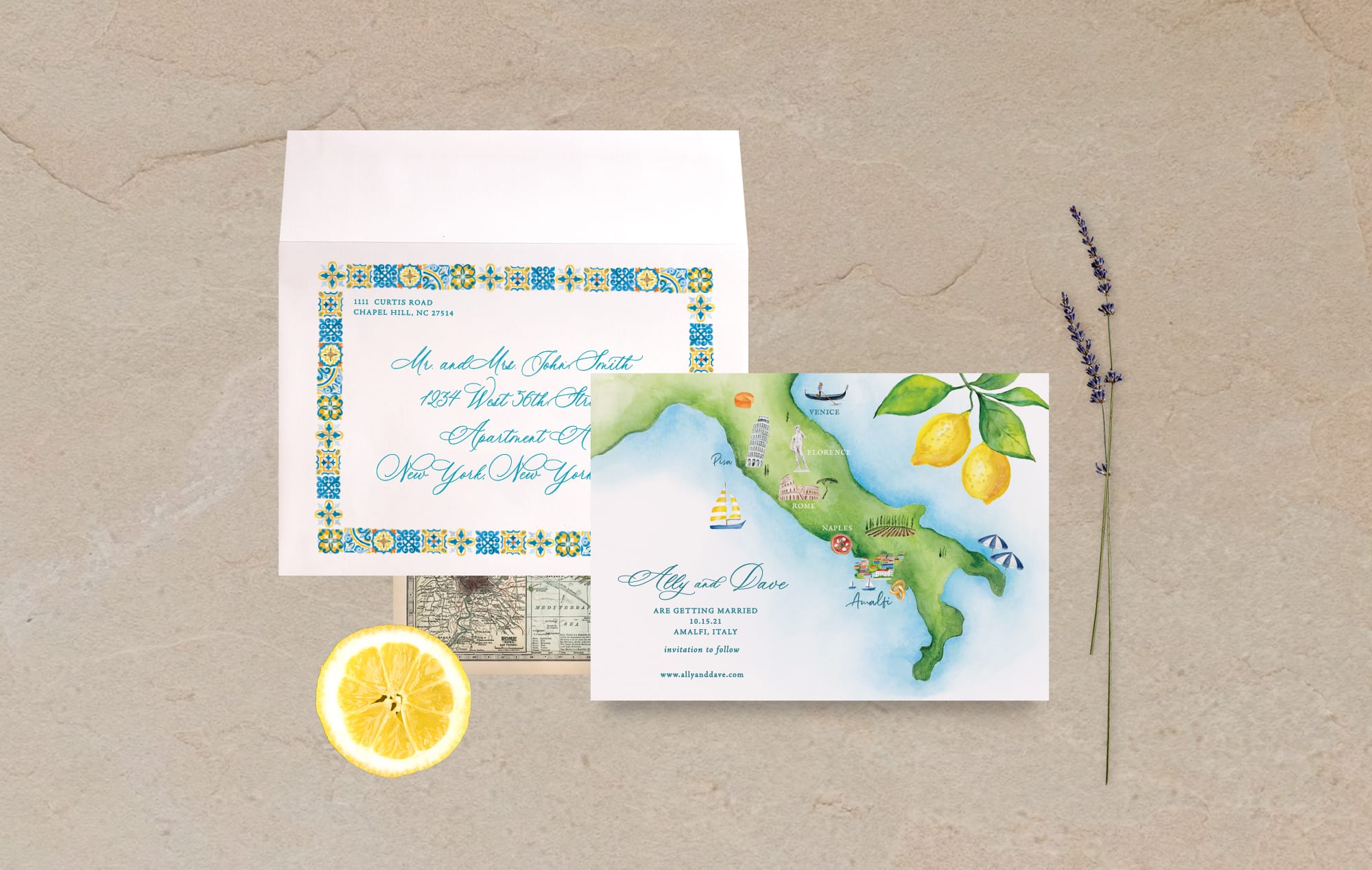
For example, designing a Lake Como wedding suite might mean translating the subtle shimmer of water and light into soft watercolor washes and gentle gradients. A Tuscan villa inspires the warm ochres of rooftops, the greens of olive groves, and the honeyed glow of sunlit terraces. Along the Amalfi Coast, pastel houses and Mediterranean vistas call for airy calligraphy and bright, cheerful accent colors.
The goal is simple: your Italian destination wedding invitations should feel like they belong there, not just that they’re “from Italy.” By letting yourself marinate in the culture, light, and textures of your venue, every detail — from illustration to color — is grounded in authenticity.
TIP 2: BUILD THE FOUNDATION IN PENCIL
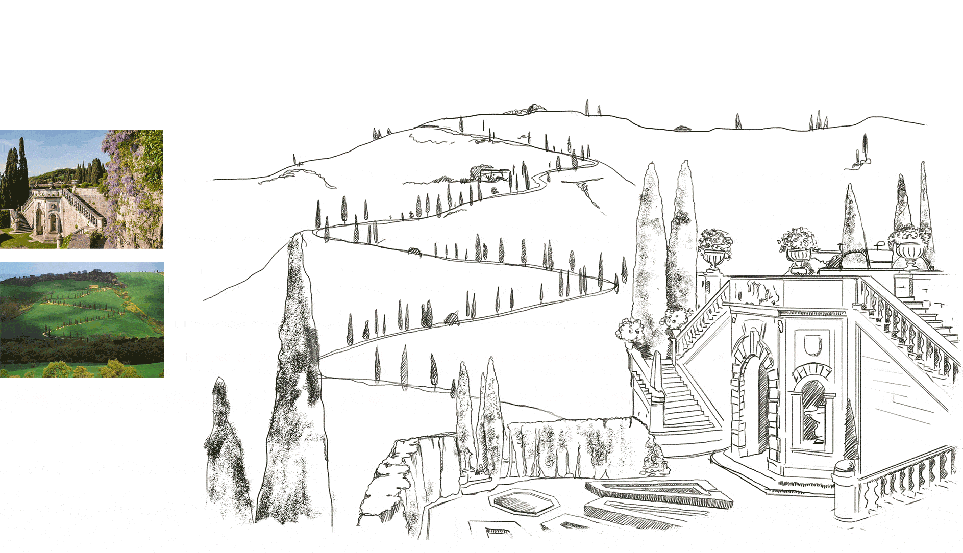
Before watercolor ever touches the page or designs get worked out on screen, we always begin with pencil. It’s the quiet, intentional stage of the process — the part where we slow down and really listen to the architecture, the landscape, and the atmosphere of your Italian destination. A sketch lets us capture the bones of the place: the elegant, symmetrical geometry of a Tuscan villa; the sweeping, dramatic curves of the Amalfi Coast cliffs; or the glassy, reflective calm of a Lake Como terrace at dusk. These early lines become the foundation of your entire design, anchoring your Italian destination wedding invitations in the authentic spirit of the location long before color, texture, or typography enter the conversation.
But sketching isn’t just an artistic preference — it’s a strategy. A pencil drawing allows the artist to give you, the couple, the freedom to collaborate deeply in the early stages. You can adjust architectural details, refine proportions, highlight the corners of your venue you love most, or weave in personal elements that make your story unique. Maybe it’s the staircase where your ceremony will take place, or the cypress-lined driveway that took your breath away during your venue tour. Taking time to slow down and think of the possibilities invites you into the creative process in a way that feels effortless and empowering.
Starting this way also prevents a common pitfall in custom invitation design: committing too quickly to color. When we hold off on color, we give the suite room to evolve organically. It allows us to fully explore the structure and storytelling of the illustration before layering in a palette inspired by Italian fresco pigments, Tuscan ochres, Amalfi blues, or the iconic botanical tones found throughout Italy’s landscapes. It’s one of the reasons our Tuscany wedding invitations, Lake Como wedding invitations, and Amalfi Coast invitations feel so cohesive — the groundwork is thoughtfully laid before a single brushstroke begins.
TIP 3: COLOR TELLS A STORY
Italy is defined by color. The palette of your destination — from terracotta rooftops and sun-washed hills to olive greens and sea blues — tells a story before a word is read. At Atelier Isabey, we often reference historic Italian pigments, frescoes, and local art to create palettes that feel timeless yet personal.
Even subtle decisions, like choosing green earth over phthalo green, or soft ochres instead of standard yellow, make a suite feel rooted in place. Envelope liners, watercolor washes, and foil accents are carefully curated to evoke the textures, light, and history of the region. Every color choice, every paper texture, becomes a subtle echo of your wedding location.
TIP 4: TYPOGRAPHY IS TIME AND PLACE
Typography isn’t decoration — it’s storytelling. And in Italy, letters have a long, practical history that spans everything from ancient Roman inscriptions to mid-century travel posters. That range gives you an incredible palette to work with when designing Italian destination wedding invitations, because the right typeface can quietly reinforce the feeling of your location.
For a wedding at a Tuscan estate or historic villa, classic serif lettering rooted in Renaissance engravings or traditional bookplates can bring a sense of structure and heritage. These fonts echo the region’s architecture and materials — stone, carved plaques, symmetrical facades — without feeling forced. On the Amalfi Coast, the mood shifts. Invitations for this region often benefit from lighter, more fluid scripts or clean retro lettering inspired by old Italian signage and vintage travel graphics. These styles naturally reflect the coastline’s brightness, its relaxed movement, and the visual rhythm of cliffside towns. Even Lake Como has its own typographic cues. Understated serif fonts or modern calligraphy with clean forms tend to complement the area’s refined, architectural quiet — the villas, the water, the balanced, symmetrical lines.
The point isn’t to match your venue literally, but to choose a typographic voice that feels consistent with the environment your guests will step into. When the typography supports the illustration, color palette, and layout, your Italy wedding invitations feel cohesive and intentional — not because they’re overly ornate, but because every choice is grounded in the visual language of the place.

TIP 5: THE DIFFERENCE
What transforms a wedding invitation from simply beautiful to genuinely unforgettable is the presence of details that speak to your story. Maybe it’s a border inspired by the tiles of your favorite Italian trattoria, a pattern echoing a Sicilian tapestry you fell in love with, or an illustration of the villa where you’re exchanging vows. These design choices do more than decorate — they anchor your suite in a sense of place, making it feel authentic, intentional, and deeply connected to your destination. This is the heart of luxury Italian wedding stationery and bespoke destination wedding design.
Personal touches don’t always have to be grand gestures. Sometimes it’s a small motif, a color pulled from your venue’s stonework, or a subtle texture that mirrors the landscape. Guests might not identify every reference outright, but they’ll feel the thoughtfulness woven through your suite. Those quiet, meaningful elements help create an experience that’s cohesive from the moment the envelope is opened, turning your invitation into a keepsake that reflects the spirit of your celebration.
PUTTING IT ALL TOGETHER
If you’re starting to imagine how all of these elements could come together for your own celebration, exploring real examples can be incredibly helpful. Our Italian wedding invitations gallery features suites inspired by Lake Como, Tuscany, the Amalfi Coast, and Sicily — each one shaped by place, story, and intentional design. It’s a great way to spark ideas and envision the look of your own destination wedding stationery. And when you’re ready to begin the design process, you’re always welcome to reach out — we’d be delighted to help you create something that feels deeply personal and beautifully rooted in Italy.